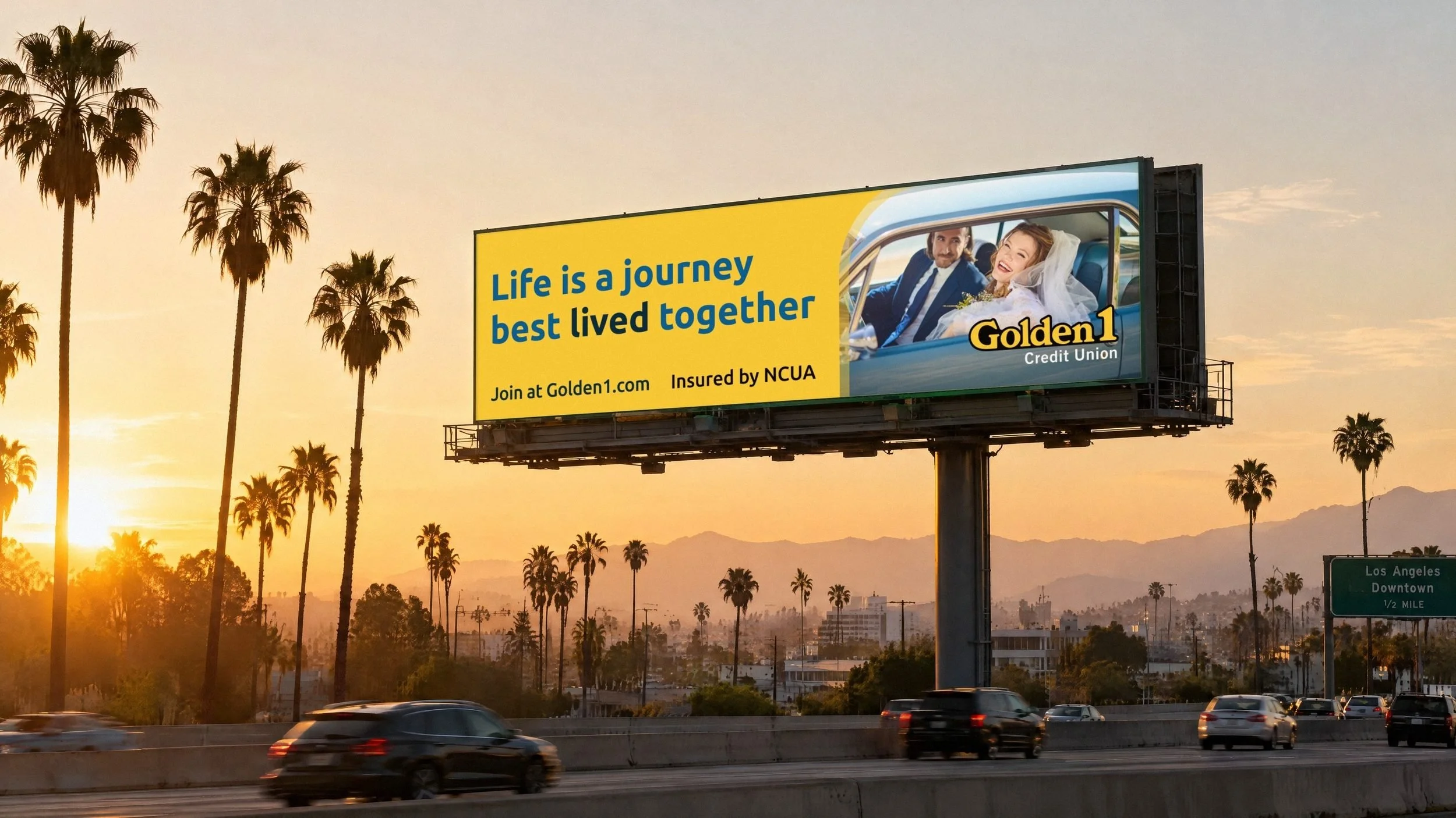
Client: Golden 1 Credit Union
Title: Brand Guidelines
Hook: A brand as big as California.
Intro: Golden 1 had deep roots in Sacramento and the San Joaquin Valley. But as it expanded across California, the brand needed to grow with it.
Inspired by the people, places, and vibrant lifestyles that make California unique, I built the brand guidelines from the ground up. Real Californians brought authenticity to the photography, a warm and welcoming voice reflected the brand’s personality, and a color palette inspired by the state tied it all together.
As Golden 1 grew, so did the guidelines, expanding into Business Services, video, social, and mobile.
Problem: A brand beloved in Sacramento needed guidelines that could carry it across the whole state.
Insight: To feel like an invitation to California, the brand had to look and sound like California.
Solution: Guidelines built from scratch around real Californians, a welcoming voice and a palette named for the state.
Role: Brand Guidelines
Design & Art Direction

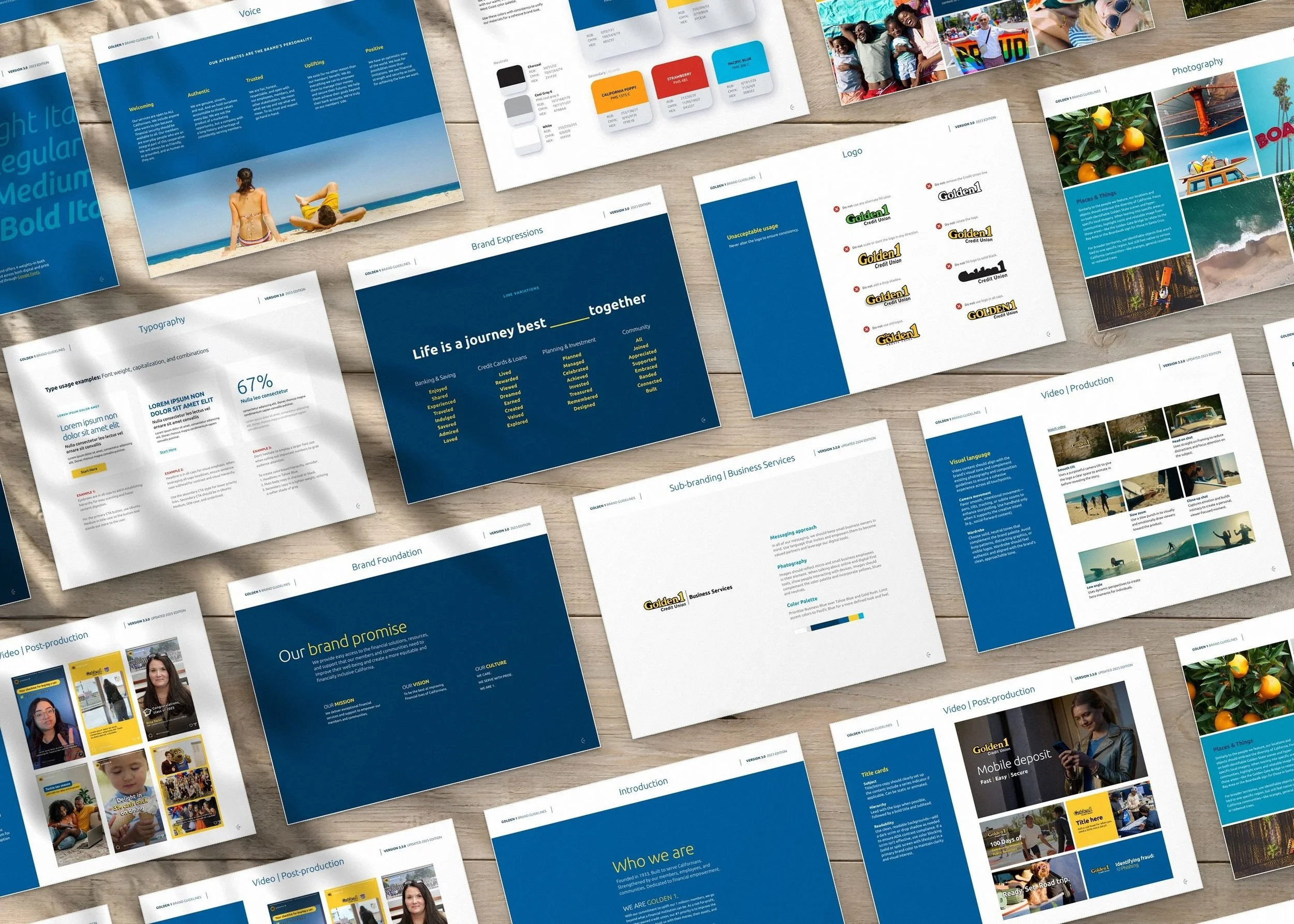
Heading: Every page, built from scratch.
Intro: Version 3.0 covered everything from the brand promise and logo to color, type, photography and voice.

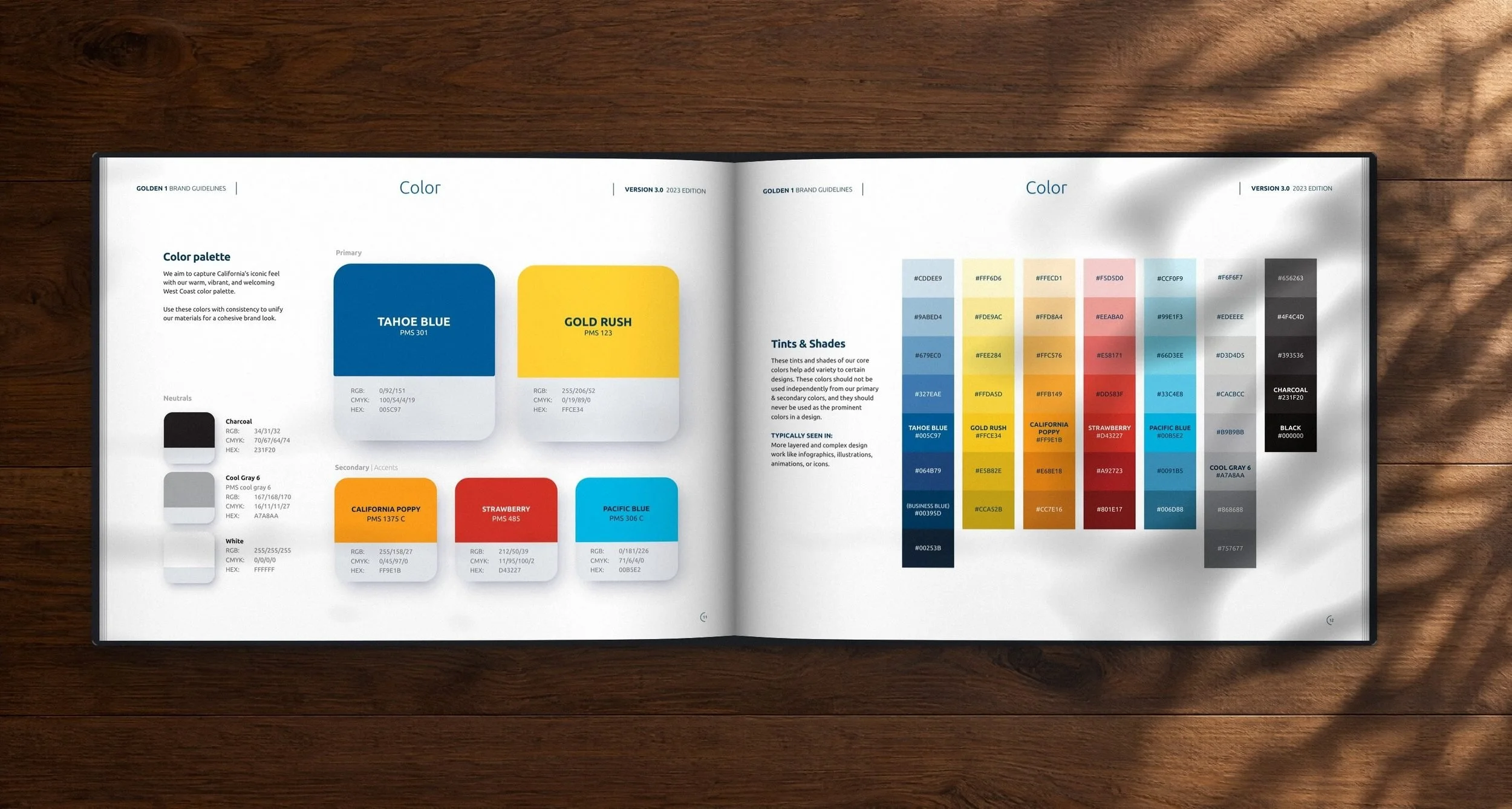
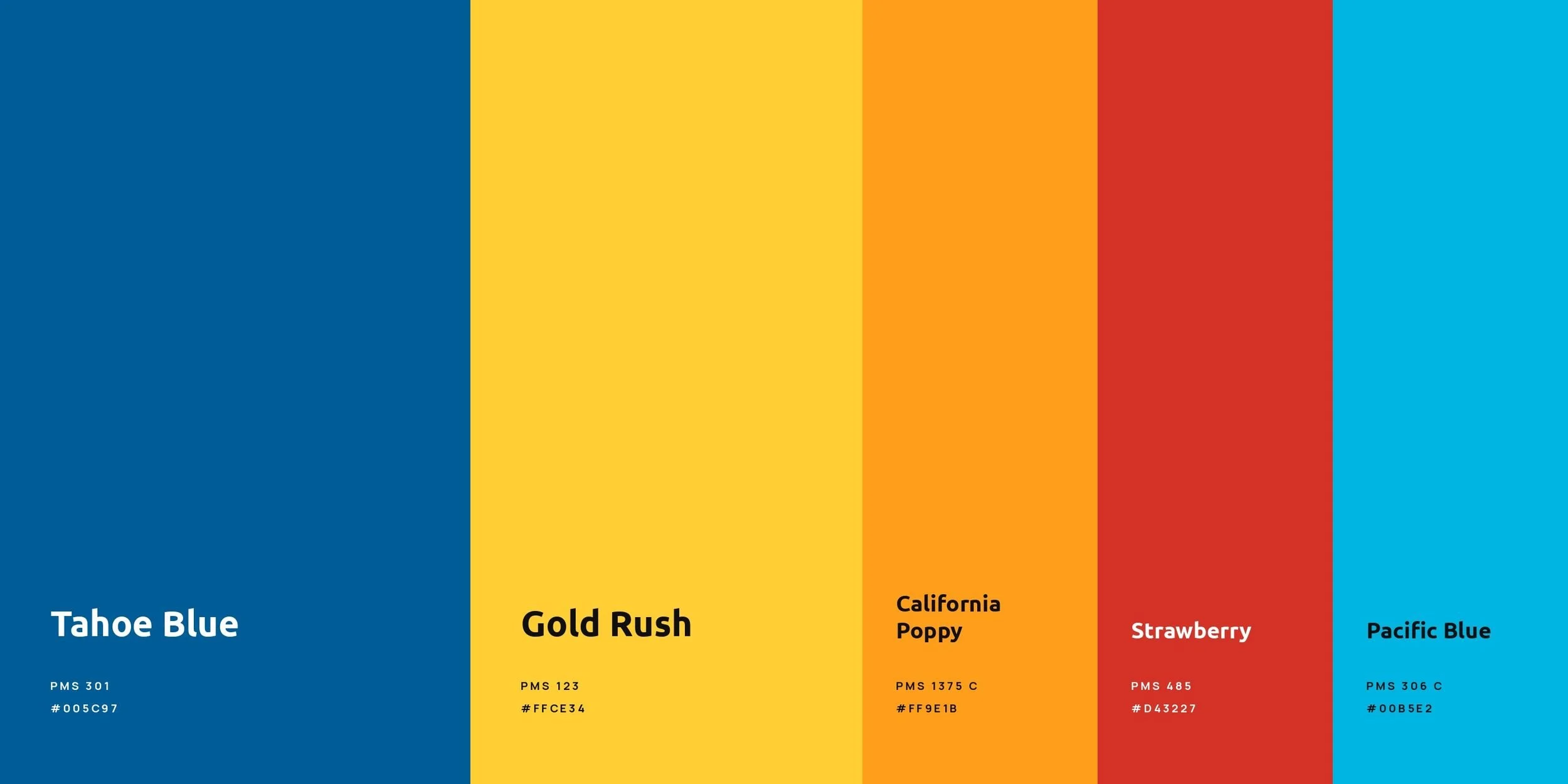
Heading: Named for California.
Intro: Tahoe Blue and Gold Rush lead, with California Poppy, Strawberry and Pacific Blue as accents.
Captions: The mark and its clear space | The palette | The color pages
Wide: 1,2,3
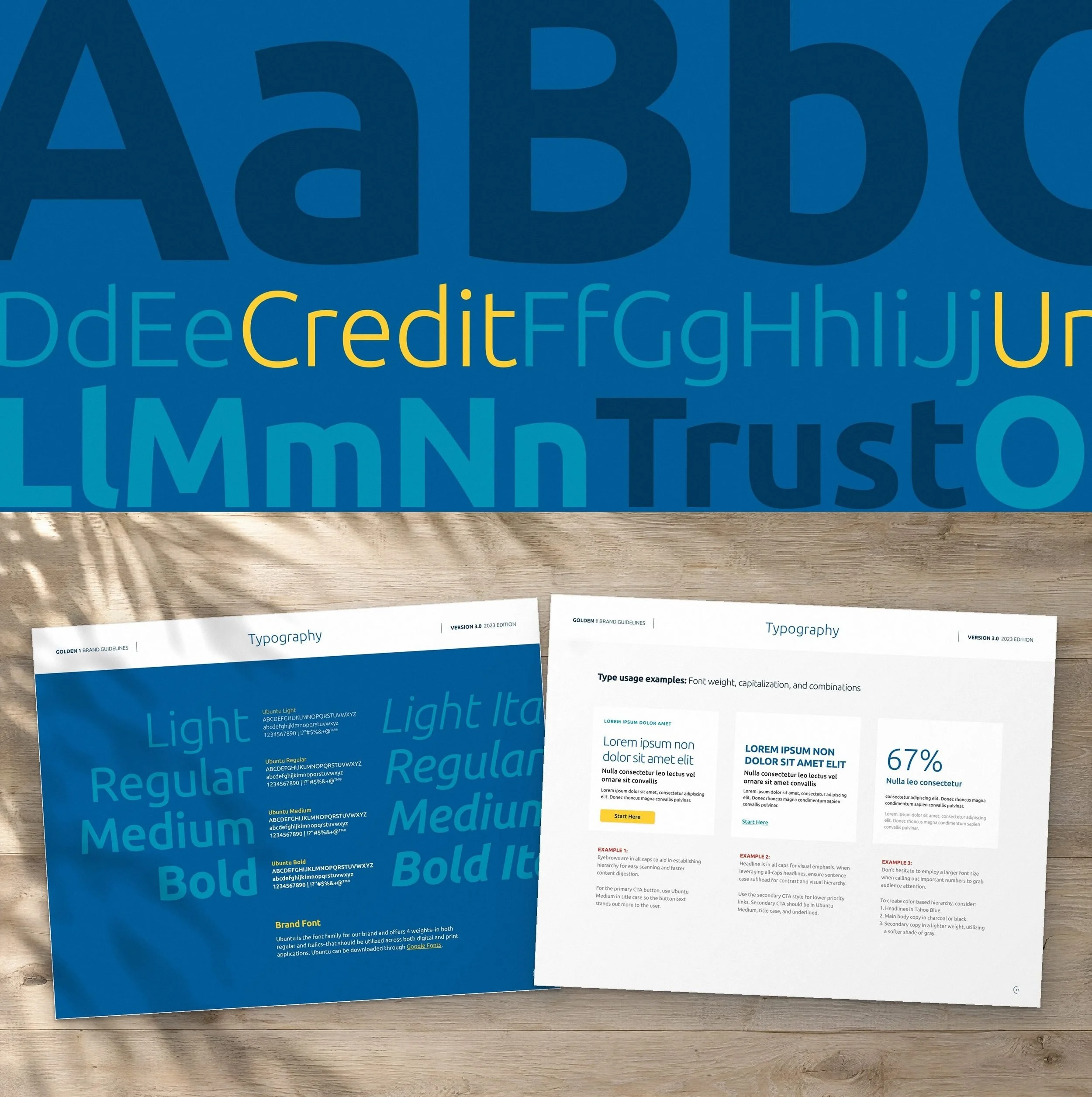
Heading: One typeface, every voice.
Intro: One brand font carries everything, from big headlines to body copy.
Captions: Typography
Wide: 1

Heading: Real Californians, real places.
Intro: Sunny, warm and true to the Golden State, from the Boardwalk to the redwoods.
Captions: Photography
Wide: 1
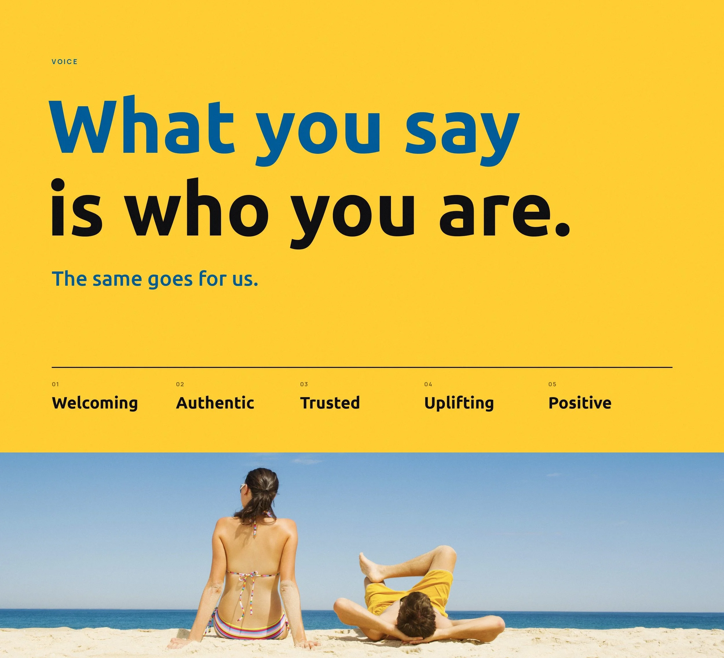
Heading: Sounds like a neighbor, not a bank.
Intro: The tone of voice guide gives every writer the same starting point, so Golden 1 sounds like itself on a billboard, a branch sign or a text alert.
Wide: 1
Heading: One line, endless verbs.
Intro: Life is a journey best lived together. The guide teaches one line with a verb that changes, so it flexes for every product and life moment.
Roles: loop
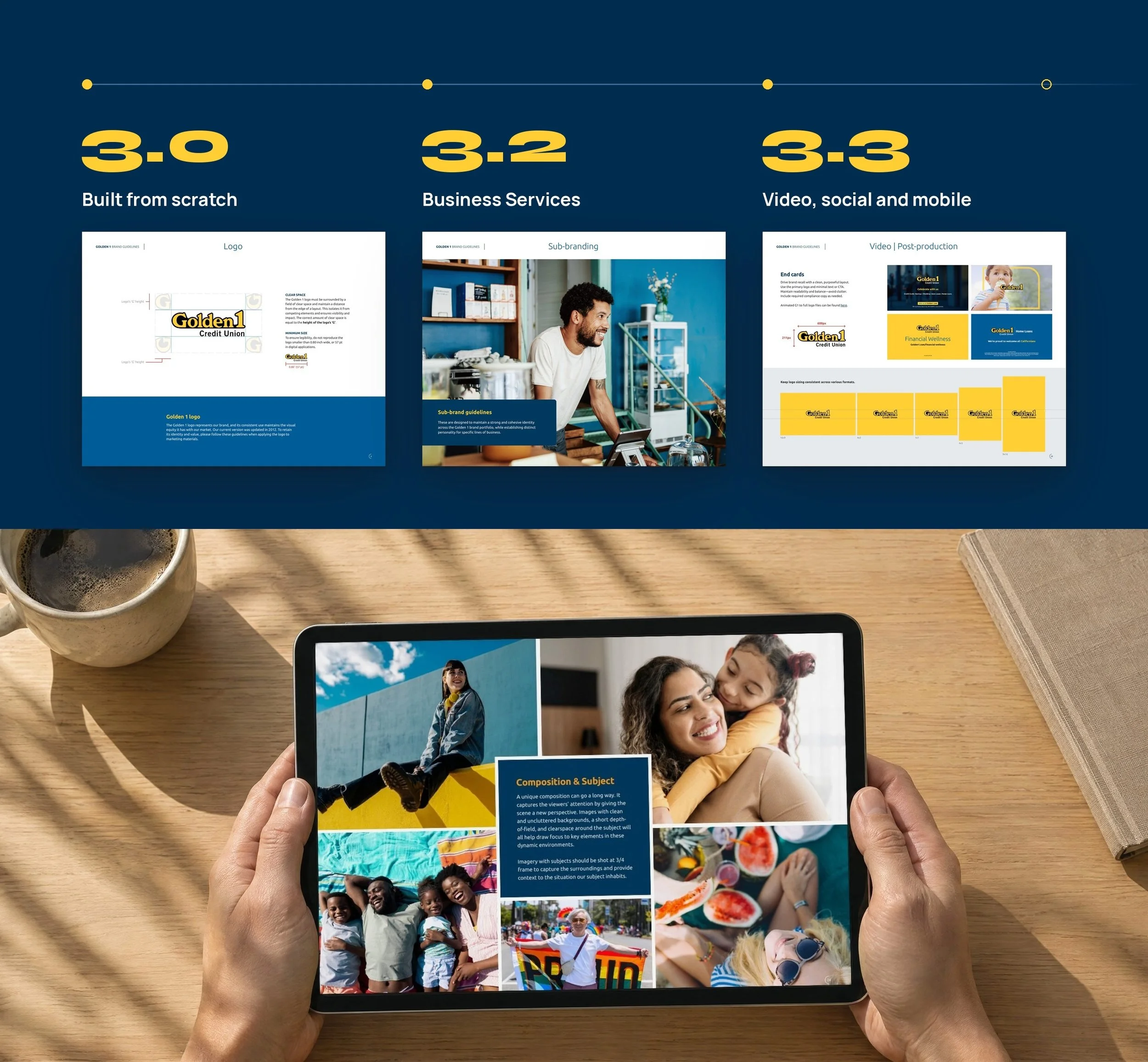
Heading: Built to grow.
Intro: The guidelines were never meant to sit on a shelf. They’re a living document that grows with Golden 1, adding new sections as the brand takes on new products and new channels.
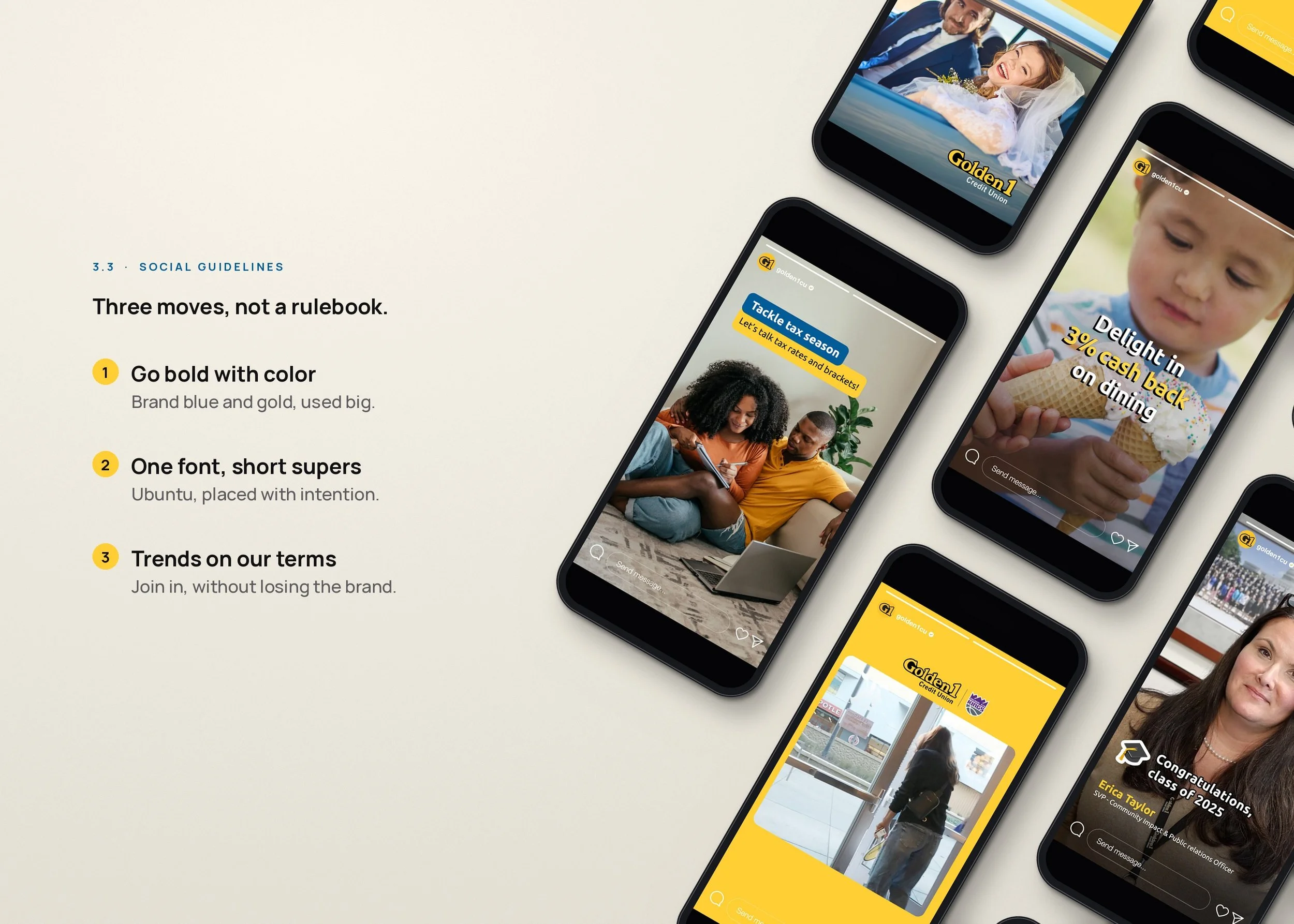
Heading: Loose enough for the feed. Tight enough to stay Golden 1.
Intro: Social moves faster than any other channel. The 3.3 guides keep it simple, so every team can post quickly and still look like Golden 1.
Wide: 1
5 | colors | Named for California | Tahoe Blue, Gold Rush, California Poppy, Strawberry and Pacific Blue.
3 | versions | Built to grow | 3.0 built from scratch, then Business Services in 3.2 and the video, social and mobile guides in 3.3.
5 | voice traits | One way of speaking | Welcoming, authentic, trusted, uplifting and positive.
1 | brand font | Ubuntu everywhere | From the guide pages to the social supers.